The Aesthetics Of The P K Kelkar Library
March 2023
The PK Kelkar Library is one of India’s most iconic library buildings, and in this essay I’m going to unpack what makes it so aesthetically pleasing.
Not.

The first time someone pointed out the library (on the way back to Hall 13 from a boring Orientation session), I found it pleasing to look at. This impression, however, was shortlived, as I soon discovered that I was looking in the wrong direction. That was the L20 building, and the library was the structure opposite it. I had probably glanced at both buildings and concluded that the large, imposing one would be the library; at any rate the one in front looked too shabby to be the one. The PK Kelkar Library had made a cold and unwelcoming impression, not dissimilar to the one its namesake, the first Director, makes on freshmen every year when they are made to hear the legend of HR Khadim on the blistering tarmac of the airstrip[^1].
I readily admit that I don’t have much knowledge on the subject of architecture, but I have a keen sense of what looks nice (some call it aesthetics). The thoughts expressed here are my subjective opinions, informed by my own tastes. The Wikipedia page on Brutalism corroborated too many of my qualms with its design to make me reconsider writing this.
I’m certain most people, aesthetics connoiseurs or not, would agree that the old academic buildings at IITK are gloomy. I’m sure some of it has to do with the fact that academic buildings are associated, unsuprisingly, with academics. But I’d like to extrapolate this general statement about vibe to a more specific observation; academic building architecture at IITK is gloomy and soulless (excluding a few new buildings like the aforementioned new lecture hall complex).
The problem with the PKK library isn’t unique. It faces stiff competition for the title of most unappealing building, including from the above featured Faculty Building, whose cute spiral staircase is the one saving grace in an otherwise soul-crushing labyrinthine leviathan[^2]. This is because these structures were designed according to a common aesthetic style by a certain Achyut Kanvinde [^3]. This style makes exclusive use of rectangular, functional elements and takes pride in unpretentiousness and simplicity. It reflects the zeitgeist of its time well, with its emphasis on production, industry and functionalism inspired in part by the Soviet model, with a yearning for the (then) new and the modern, and detachment from the past.
It does appeal to a certain set of people who, probably as an acquired taste, like the architect and ideologue Le Corbusier, whom some Indians would know by virtue of his ‘involvement’ with Chandigarh. Since this is not a diss piece on le Corbusier and he isn’t directly responsible for the eyesore of interest, suffice it to say that I, and many others, hold him responsible for a lot of the soullessness plaguing the cityscapes of today.

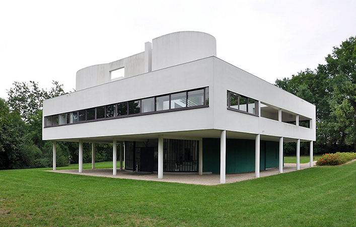
Le Corbusier’s Villa Savoye, which might be one of the inspirations for the library’s shape, isn’t half as unappealing, and might be a useful point of comparison. Almost every feature the library building has added to the basic house-on-stilts idea has made it worse- the giant protruding projection on top, the windowless brickwork bulwarks and the lack of paint. It isn’t a very pleasant place from the inside either, with an abject lack of daylight and rather rickety furniture.
The brick and concrete surface evokes the same emotions evinced by the sight of a flayed corpse, and not just because of the similar colour palette. Adobe and mortar, like flesh and sinew, are indeed raw and fascinating, but for the sake of civilised society best left covered by hide or shroud.

The unfinished building in this image could be plausibly mistaken for an academic area building. Coming from the developing town of Taloja, the droll, plasterless cuboidal exterior and exposed wall-less columns chiefly remind me of such under-construction buildings. Thanks to a half-decade of solitude in the eerily silent company of such structures, I have come to associate them with lifelessness, incompleteness and desolation.

Separately, it also reminds me of the naked cityscapes of the impoverished quarters of Northern Indian towns, which can be observed in nearby Nankari. In a way, for an institution squarely in the Indian heartland, it is fitting, but in any case it is hardly a very flattering reminiscence.
Indeed, part of why it fails so miserably is that in today’s India, this aesthetic isn’t unique or unparalleled. There is no element of brutalist surprise that might be due if such a building were encountered in the Global North. Indeed, in the India of the 60s, such a building might have even evoked a sense of awe at the rawness, and at the simultaneous modernity and earthiness of the imposing masonry. But that was an India of thatched huts, Mughal monuments and colonial colossi, not one where brickwork and cement came to symbolise half-fulfilled dreams.
As is apparent, I don’t consider the design and architectural style of the library itself too appealing. However, I doubt I’d have paid as much heed if there were a semblance of upkeep. Non-maintenance and neglect, or maybe just the inevitable corrosion by the invisible sands of the inexhaustible celestial hourglass, gives the buildings the feel of decaying ruins, replete with discolouration. I couldn’t agree more with the cultural critic Theodore Dalrymple when he speaks of
… the horrors of Le Corbusier’s favorite material, reinforced concrete, which does not age gracefully but instead crumbles, stains, and decays.
I don’t mind brickwork as much- it at least has some character, some colour, some earthy flavour like the kulhars used for serving chai. If used well, it has an effect not dissimilar to sandstone. Exposed cement, on the other hand, is barely tolerable when fresh, and plain horrendous in a state of weathered decay in a clime like North India’s.

The library can not be demolished, I suppose, so the next best thing would be to paint it like the new academic area buildings. Till then, I can only look away, towards the L20 building, while I sit beside the colourfuly lit fountains that cast cosmetic colours on the concrete columns like rouge on a senile woman’s creasy cheeks.
Ramblings on other campuses

The relative absence of concrete, the use of circular elements, and the large windows that actually allow some daylight in makes Louis Kahn’s designs for IIM Ahmedabad much more palatable.

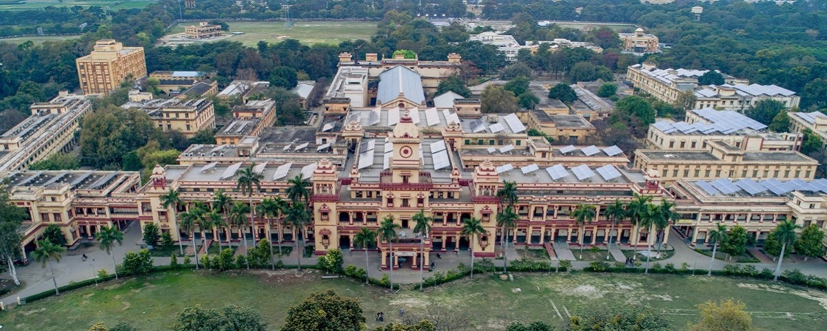
My personal favourite amongst the institutions I have visited is the architectural aesthetic of BHU, which draws from multiple architectural traditions- the Hindu rajwadas and mandirs, the Indo-Saracenic (aka Indo-Gothic or Neo-Mughal) revivalist style, and some simplifying influence of modernist architecture.
Recommended reading:
[^1] For the record, I smelt bullshit on day zero and found out PK Kelkar’s real daughter’s name within a fortnight of the incredulous narration.
[^2] I somehow manage to lose my way every time I go there
[^3] a fellow Kokani